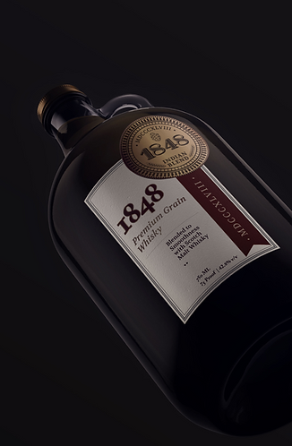
1848 Whisky packaging
Packaging design for a Whisky Bottle positioned between the premium and the ultra-premium category. The Bottle design is meant to convey a long-standing tradition in alcohol making and create good shelf visibility for the brand.
fields
Packaging, Graphic Design, Copywriting
CLIent
KALS 1848 Whisky
Year
2018

Similar Neck Curvatures
Long Generic Shapes
Traditional Boxy Shapes
Long Plastic Caps
Edgy Contour Lines

PEER REVIEW
Standing out:
Most bottles in the category are designed on traditionally used long format bottles, with labels that go around. To stand out on the shelf, I created a bottle shape much shorter and bottom-heavy to disrupt the shelf space.
Vintage:
The whisky bottle borrows from classic growler medicine and alcohol bottles. To emphasize a long tradition of producing and consuming whisky.
+
Modern:
To stand out as a modern choice amongst its peers, this whisky bottle is modelled to have a chic clean shape, with a stouter base and narrow neck and body proportions.


Vintage chic:
I created a seal/sigma to personify the brand. A brand coin is designed borrowing from old school Indian coins.
The coin becomes an identifier for the whisky and can be used in outer packaging and promotional items.


